I know I might be way out there on why I’m thinking about this. Why did Mercury use different fonts for the Mercury door tag and the name logo scripts on our classic Cougars?
Was the door tag font used anywhere else in Mercury’s division the way Ford used the same font for their logos?
Maybe, but I don’t think so, let me go through my door tag collection and present some findings. I think that each factory had several stamping machines and likely they were dedicated to Mustang or Cougar. I have noticed some trends and changes to the font or dies. It is very evident during 1968. There is also some variations in spacing on the second row. This is good, I have been planning to do this for a while.
Your Mustang door tag example is from Metuchen N.J. 1967. Factory wise, that may make a difference. I don’t have very many Mustang tags, but I do have a few 1967 Cougar door tags stamped on “Ford” blanks. They would all be from Dearborn.
Kevin’s boof=k on Tag decoding covers some of this. I’m at work now and my book is at home. But I think Scott should be able to go over to the shelf at WCCC and look in it.
The font looks like a holdover from Mercury’s earlier days. E.g.:
My guess is that the the marketing guys worked more closely with the emblem designers. The guys in charge of things like door tags just carried on as usual.
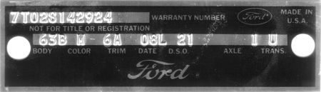
Most of Kevin’s information on dates, fonts, etc, is for the “Ford” scripted tags from Mustangs.
In most cases Cougars were stamped with a “Mercury” scripted door tag. There are two different sizes of type, and two different strikes that make a deep or shallow impression. Stay tuned.
I quick search of door tags like Scott has you could seperate the R (San Jose) and F (Dearborn) plants and see if that is the differance in font. Might also show a trend date wise.
Scott I guess it does make sense if there were multiple machines at each plant used for making the data plates. I look forward to seeing what you might come up with after your research.
Jody the Mercury font looks “inspired” by the font used in Mercury’s earlier days. I wonder why they didn’t use a font closer to the Mercury emblems on our Cougar’s?
It could be very possible that the pictures I posted could be reproduction tags. I took the pictures off of CCOA’s website and Marti Autoworks for illustration only. It’s just that I’ve seen tags on ebay sales and to me there just seems to be variances now and then. I was thinking that seeing Cougars and Mustangs were assembled on the same assembly lines they would be real consistant.
Steven
This will give you an idea of what I have to work with. Those bundles of door tags are sorted by year and plant. My 1967 ring is full.
Shown is an example of an unbroken door tag with attached warranty strip.
This is a good example of of why I think that there were no less than three door tag stamping machines or at least three different sets of dies. Shown is 3 tags on 3 consecutive days in Dearborn in 1968. Reverse shown for clarity.
I see what your referring to and I would expect that we will see the same difference is size and spacing (font seems to be the same) on Mustang tags from that same plant and year.
Are we talking about the font used for the dies or the printed “MERCURY” logo? I thought the OP was asking why that doesn’t match the MERCURY emblems on the car. If it’s the dies we’re talking about, I would think the reason they are different is simply that they wear out and get replaced.
Yes, I don’t have a sampling of 1967-69 Ford tags. There may be a distinct spacing difference on the blanks for BODY, COLOR, TRIM, etc. between Ford and Mercury.
I don’t have many examples of 6 digit DSO’s, I see strings that indicate that a worker may have left the die blank set up with the DSO numbers left oriented for 6 digit numbers in the DSO field. Other reasons could include 2 tone 2 digit color codes, causing a change in that field.
That’s quite a collection you have Scott. I can clearly see the reasoning behind the three machine theory. That can clearly lead to the differences in the tags.
Steven
Jody I was actually talking about both. I guess I might not have made it clear enough in my first post. The Mercury font looks like what you posted with a slight change. I wonder when Mercury started using the font on their tags?
Steven
Thanks, Steven, I had the majority of my tag collection way before I came to work at WCCC. Phil Parcels used some of my buck tag information and or examples when he was helping Kevin Marti with his tag book.
Was referring more to the distance in spacing and size of the letters/numbers within the stampings rather than the distance between the stamping groups
Have a fair number of Special Order ones and those all appear to ahve been stamped at the same time on those examples - height, alignment and other details appear to be the same as the rest of the stampings
Here is an example of the two metal “Mercury” door tags found on Cougars. The change included a taller row for either larger type size or to keep the stamped numbers from going outside of the lines.
The old version had a border, the new version moved the second line under the “Mercury” logo.
In Kevin Marti’s Mustang and Cougar Tagbook, in the 1968 door tag section he talks about a change from square corners to rounded corner on the top of the tags. For Cougars, San Jose changed to rounded top corners the last week of December 1967, and unfortunately I don’t have a enough Dearborn tags to make a guess, sometime between Sept-Dec. Later in the year I have examples where both factories found and used some more tags with the square corners. Last week Feb 1968 for San Jose, first week Feb 1968 for Dearborn.
Round on top, square on bottom.