Hey everyone, got another idea to run by you. I’m full of 'em this week. Thanks for being a great sounding board, by the way.
I think an XR-7 themed T shirt would be cool, and I like that it applies to multiple years. I’ve done the hard part of designing vector based versions of the logos, now I just need to decide on how to use them on a shirt. That’s where you come in! Here are some of the ideas I have. I’m pretty set on using a black shirt, and the printed graphics shown in grey would probably be a slightly metallic silver.
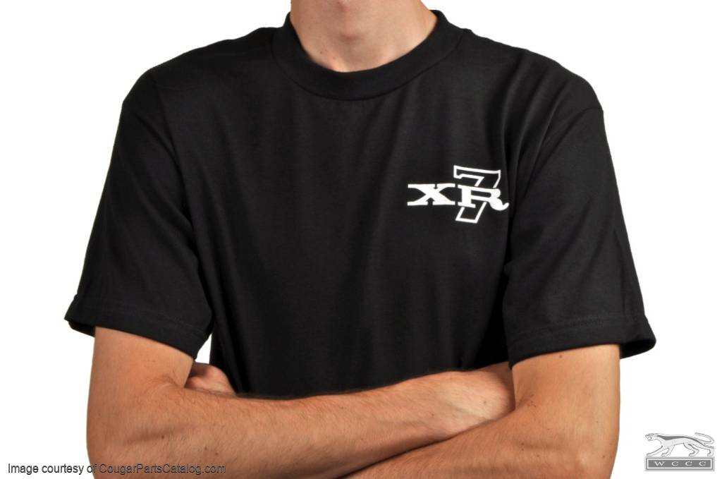
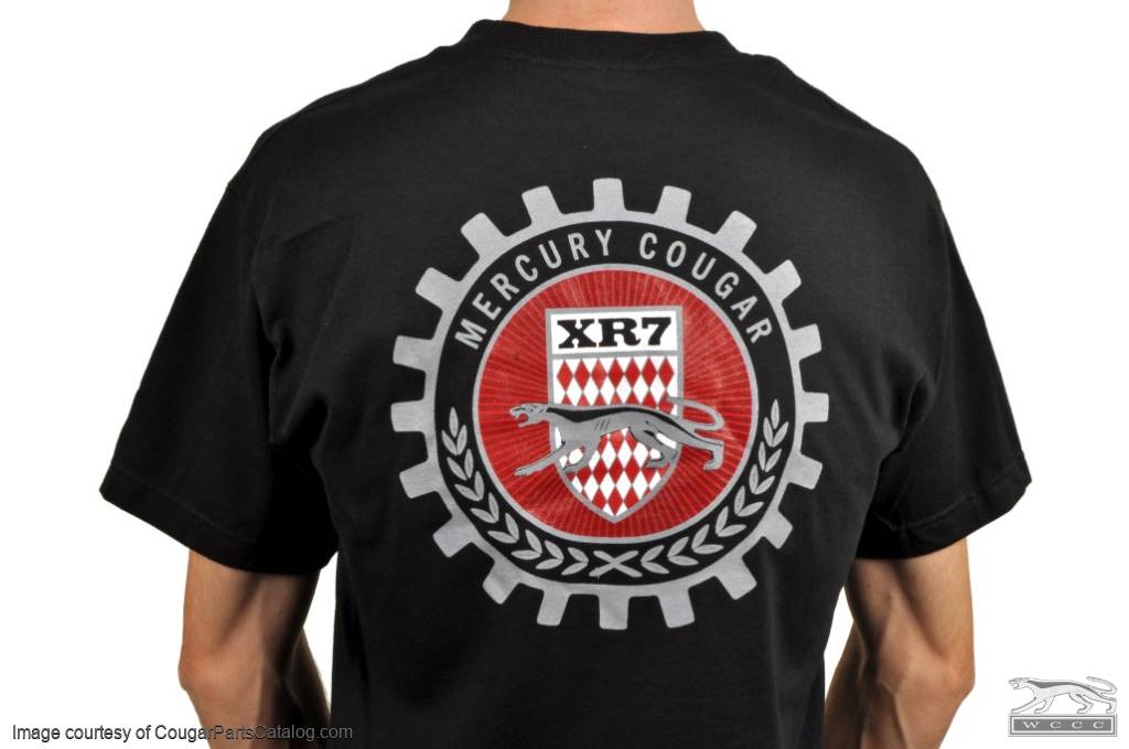
Version 1 - Small XR7 on left breast, big coat of arms on back
Version 2 - Opposite of above: small coat of arms on left breast, big XR7 on back
Version 3 - Simple design with XR7 on front only
Version 4 - Small XR7 on both sleeves (reminiscent of twin C-pillar badges) with small coat of arms on left breast
Version 5 - Big XR7 on front, big coat of arms on back
Got a better idea? Choose “other” and tell me what you think it should look like.
Personally I think I like #1 the best, but I hesitate because the big coat of arms might be a but “much” on a shirt. I have to say that I really like the simplicity of #3, but in some ways I hate to abandon the fancy crest thing. So I’m a little stuck. Opinions welcome, and thanks for looking / voting!
Personally I like #1 with a tweak. I would make the XR-7 on the front a little larger (an I stress a LITTLE ) and put the small version on the sleeves like in #4. Just my druthers.
I second cougar_nut1968. Although, I don’t think the XR7 on the front needs to be larger. However the XR7 on the sleeves was my first thought to add to number 1.
The XR7 being an upscale Cougar version deserves a more classy look which I would say #4 fits the bill. Version #1 comes in at a close second though. Love the C-pillar reference with version #1 too.
Honestly, I say…all of the above. It is hard to just pick one. I guess if I were to only pick one, I would say # 1, but I can’t complain about any of them. They are all good ideas.
The XR-7 script works independently of the shirt color. Black is going to be too hot for the south west part of the US. The XR-7 on the sleeves is a good touch. I would work on the round logo to try to get to a design that works with any color shirt.
OK, I voted for #1 also, but I’d like to add ‘GT’ to one sleeve and ‘4 SPEED’ to the other. If its just text, maybe the sleeves could be user customized?
BTW, was the ‘coat of arms’ an official logo or is it custom? If official, for what years? It looks like the XR7-G logo redesigned. I like it.
The people have spoken! The shirts have been made. I was tempted to do the #4 sleeve design, but opted to go with the popular vote. I’m happy with how they turned out!
And yeah that’s me modeling it… we have limited resources around here.
These are now available to order from our website in S, M, L, XL, XXL, and XXXL. Thanks for the input everyone!
Also re: Bill’s comment about black shirts: I hear ya about the hotness factor. But to me, black was the only color that really made sense with these logos. It just works. Tell ya what though, maybe next I’ll do a red/maroon shirt with an XR7-G logo. Eh?